Completing Simon Game and my Front End Certification
5 min read · August 27, 2017

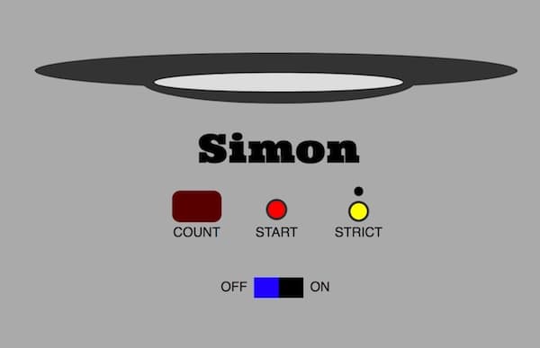
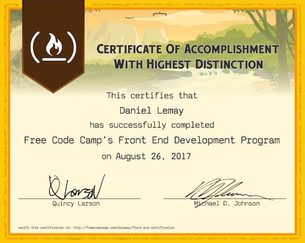
On Saturday night, the 150th day since I started my coding journey on Free Code Camp, I completed the Simon Game project and claimed my front end development certificate. It's been an amazing start to my journey as a developer, and I'm amazed at how much I have learned in such a relatively short period of time. You can find the live version here and the code on Github
The Simon Game project brought some unique challenges that were really helpful for my growth. I chose to develop the UI on this project first, and fully built all of the React components with basic styling before adding any functionality. Sorting out how to make the color play buttons display properly with selective border radii, and then how to position the game controls took a little while. I have dabbled in CSS positioning a little bit, but this was more complex, especially later when I tried to do some cross-browser testing. There are a total of 6 React components in this project: App, ColorPlayButtons, Counter, Start, Strict, and PowerButton. This project uses flex box almost everywhere. It's an essential layout and spacing tool, that I don't know what I would do without. I still need to check out CSS Grid though. Flex box really comes in handy when it comes to making sure the design is responsive.
When it came to adding functionality I started with the basic components and functionality first, before addressing the more complex logic. I completed the functionality of all the control buttons and created the methods on the App level for them to alter states that would be necessary for the game to run such as triggering flags for the game being on and whether Strict mode was enabled. Creating the method for the computer to play the pattern of buttons to press for the user was one of the more challenging ones to build out and was good practice on learning how to use recursive functions. The method accepts a count parameter for the current position in the pattern array being played. Using ES6 default values, it defaults to 0, or the first item in the array, if a parameter is not passed. The method finds the ID for the current index of the pattern array, assigns the sound and active color for that particular button to separate variables, and then applies them. After an 800ms delay it removes the active class to return the button to normal coloring. If the current count is less than the number of buttons stored in the array, the counter increases by one and recursively calls the method again. If not, it sets the players turn to true to allow the player to enter the pattern.
computerPlayButtonPattern(counter = 0) {
    var states = {
      isPlayersTurn: true,
      playerCopyPattern: []
    };
    states.moveCount = this.state.moveCount === "! !" ? this.state.buttonPattern.length : this.state.moveCount;
    var activeColors = ["active-green", "active-red", "active-yellow", "active-blue"];
    var pattern = this.state.buttonPattern;
    var id = pattern[counter];
    var sound = id === 0 ? new Audio(simonSound0) : id === 1 ? new Audio(simonSound1) : id === 2 ? new Audio(simonSound2) : new Audio(simonSound3);
    var el = document.getElementById('btn-' + id);
    if (this.state.gameOn) {
      el.classList.add(activeColors[id]);
      sound.play();
      setTimeout(() => {
        el.classList.remove(activeColors[id]);
        if (counter < pattern.length - 1) {
          counter++;
          this.computerPlayButtonPattern(counter);
        } else {
          this.setState({...states});
        }
      }, 800);
    }
  }
Unique challenges
Some of the biggest challenges for the project came while completing my final project tasks: making the design responsive on smaller devices, and testing the app on different browsers. When I initially created the design, I set a static size for the color play buttons of 300px square. This was great for desktop use, but wouldn't scale down with smaller screens. It would be easy enough to make the width dynamic as the container holding the whole game is a flexbox; however, I didn't know how to maintain a 1:1 aspect ratio between the dynamically adjusting width and the height. After some research, I found a work-around that involved using the top padding property to mimic increasing the height. I converted all of the elements to use this to adjust the size of the component containers. If ever I doubted the benefit of having a container div to house a layout, this removed those doubts. After that, it was a matter of writing a bunch of custom media queries which reduced text sizes and the widths of the controls components. It took about an hour to get everything all sorted out, but I made it at last...until I decided to open up the project in some other browsers.

First was Safari, which apparently handles absolute positioning declarations differently than Chrome. I tinkered around with the absolute positioning and tried using percentages on a whim. After discovering that both Chrome and Safari interpreted this correctly, it was a matter of trial and error to get the percentages for both top and left positioning to be just right. Firefox was a whole different animal. When I first opened it up I remarked that I built a spaceship. I had no idea why it was rendering like this. I started experimenting and found that if I set a static height for the app that it would render properly. I couldn't keep a static height as that would break the responsive design, but it pointed me in the direction that the issue likely lived within setting the height of the color play buttons dynamically. After some more tinkering and research, I tried using the before pseudo selector and placing the top-padding within the selector, which properly rendered on all three browsers. Finally...
The Completion of my Front End Certificate

It's exciting that this has time has come and my hard work has paid off. I'm thinking about what steps to take next and am thankful for people that have let me think out loud and who have given some guidance. I really enjoy front-end development, especially working in React. I want to work on a larger project, whether on my own, or finding a designer to work with. I know that this will provide some valuable experience, especially when I'm looking for jobs. I also have started the back-end certification on Free Code Camp. I don't think that I want to specialize on back-end at this time, but I want to have a better grasp of how everything interplays together. There will definitely be more to come. Thank you to all who have been following the blog thus far and have encouraged me in my development journey. The development community, especially those participating in #100DaysOfCode has been amazing, and I continue to meet some wonderful people.